The First Post!
Preface
While writing this, I realized just how momentous it is to finally have my own website. At the same time, it had occurred to me that every word I write down will be on the internet! I know my writing is sub par so It is terrifying to have a “finality” to it. I can probably just write in my personal journal without posting it to the internet, but I don’t get the same incentive to improve my writing that way. I always cringe when looking back on my older writings, and I know I will cringe at this in a years time. Maybe I should embrace it. Maybe that should be my motto from now on: to write things that will make me cringe in a few months or years.
The First Post!
This is the first post ever. Hopefully it won’t be the last. That sounds a bit ominous. I meant to say hopefully I won’t be a bum.
I think this post will serve as a CSS style guide and I continue to tweak and fine-tone this website. Nevertheless, the completion of the Jekyll blogging system marks the point of substantial completion for this website which, now I think about it, is actually quite impressive. I should celebrate a little bit!
Design Philosophy
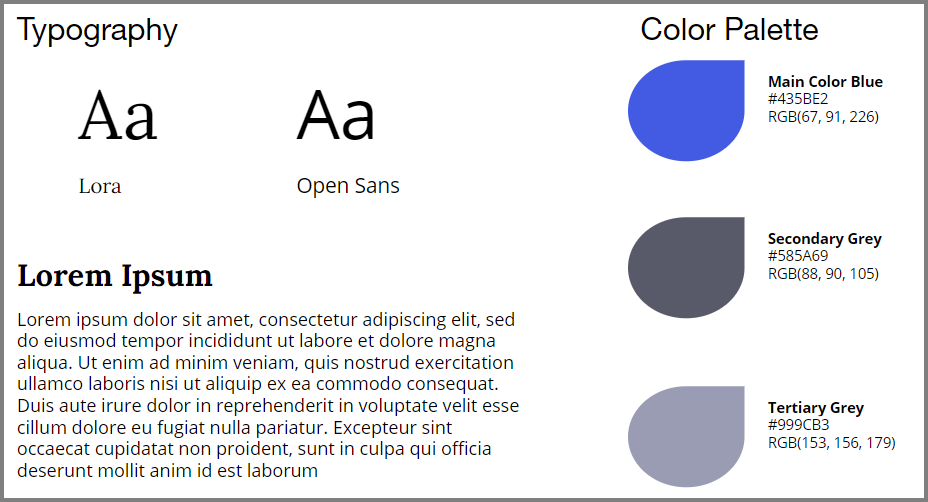
 Figure 1: Design Philosophy and Layout
The color palette and typography I chose is summarized above. I am using Lora, a serif font for my headings and blog paragraphs, and Open Sans, a san-serif font for some miscellaneous texts. I am using a line-height of 1.6 and a line length of around 70 characters for improved readability.
I chose a purple-ish blue for my main color, and two shades of grey for texts, along with minimalist white as my background. I find that black text on white background is a somewhat jarring and overly bland. I think the grey adds a layer of sophistication.
In terms of design philosophy, I think I prefer the Baushaus aesthetics of “less-is-more”. My preference is partly a matter of taste, and partly a limitation of my own ability in that I do not know enough HTML, CSS, JS to make anything more sophisticated.
I think the minimalist appeal really caught on because of Apple. At the same time, our lives are becoming increasingly hectic and overloaded. Everyone owns too much stuff… Think about the social media accounts, the passwords we need to remember, credit cards, student loans, rent payments, and so on. Most importantly, we are overloaded by information. A Google search of “how to cook mashed potatoes” yields 42,300,000 results in 0.93 seconds. I don’t know what the rest of the 42,299,990 results are for. This general overload of everything birthed a strong preference for minimalism. Our lives are already cluttered enough, things of relative minor importance should convey simplicity and not add to the clutter. I think minimalism is here to stay.
Everything below this is a style guide.
All headings within articles should be H2. Below is an image. This is an emoji ![]()
 Figure 2: Image caption by inserting italic text after image in markdown (source: unsplash)
Lorem ipsum dolor sit amet consectetur adipisicing elit. Atque neque veritatis aperiam numquam at, error itaque maiores doloribus! Deserunt nemo porro dolores accusantium commodi, rem nostrum quisquam inventore consequuntur vero.
Lorem ipsum dolor sit amet consectetur adipisicing elit. Atque neque veritatis aperiam numquam at, error itaque maiores doloribus! Deserunt nemo porro dolores accusantium commodi, rem nostrum quisquam inventore consequuntur vero.
H2 - Main Section Titles
H3 - Sub-section Titles
H4 - Occasionally Another Level
Lists
Ordered List:
- first
- second
- third
Unordered list:
- item 1
- item 3
- item 3
Tables
| a | b | c | d | e |
|---|---|---|---|---|
| 1 | 2 | 3 | 4 | 5 |
| f | g | h | i | j |
| 6 | 7 | 8 | 9 | 10 |
Quotes
A quote looks like this:
Life can only be understood backwards; but it must be lived forwards. — Soren Kierkegaard
LaTex Equations
\[(\frac{m}{\Delta t ^2} + \frac{c}{2\Delta t})u_{j+1} = P_j -(\frac{m}{\Delta t ^2} - \frac{c}{2\Delta t})u_{j-1} - (k-\frac{2m}{\Delta t^2})u_j\]Code Snippet
  # recursive implementation of golden section search
  import math
  invphi = (math.sqrt(5) - 1) / 2  # 1 / phi
  invphi2 = (3 - math.sqrt(5)) / 2  # 1 / phi^2

  def gssrec(f, a, b, tol=1e-5, h=None, c=None, d=None, fc=None, fd=None):
      (a, b) = (min(a, b), max(a, b))
      if h is None: h = b - a
      if h <= tol: return (a, b)
      if c is None: c = a + invphi2 * h
      if d is None: d = a + invphi * h
      if fc is None: fc = f(c)
      if fd is None: fd = f(d)
      if fc < fd:
          return gssrec(f, a, d, tol, h * invphi, c=None, fc=None, d=c, fd=fc)
      else:
          return gssrec(f, c, b, tol, h * invphi, c=d, fc=fd, d=None, fd=None)
Videos
Comments